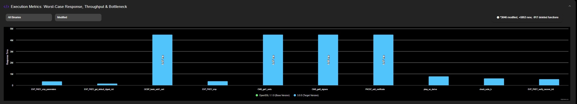
In the Charts, performance degradation is presented for a single version or as a comparison between two versions. It is visually represented as:
Blue Bars: Performance of Target Version
Performance of Target Version
Green Bars: Performance of Base Version (Version with which the Target Version is compared to)
Performance of Base Version compared to Target Version
Last updated 1 month ago